
4 Additional Brand Elements You Need for Your Website
So, you have your brand colors, fonts, and a logo…
Is that all you need for a new Squarespace or Square Online website design project??
Definitely not unless you want a very stark and not very well branded site, and I’m sure you do not want that!
So lets get you prepared with a few extra elements:
A favicon or browser symbol to enhance brand recognition
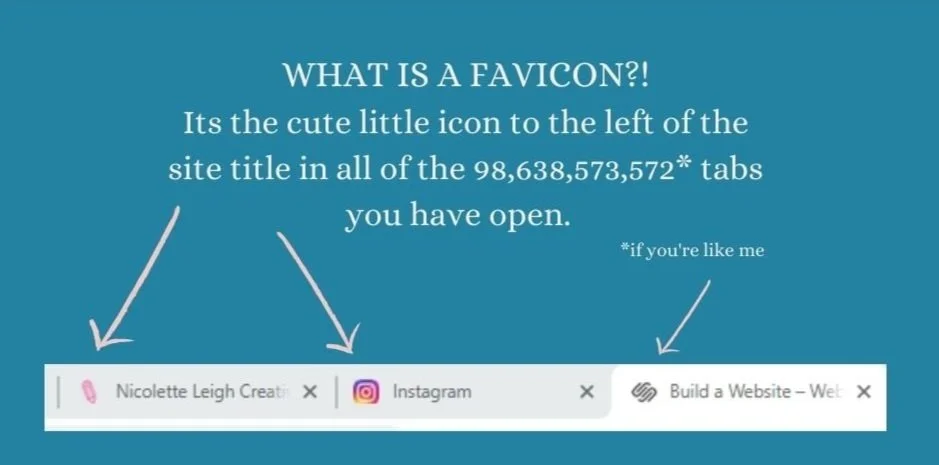
A favicon can be easily designed in Canva. Start with a file that is between 100px × 100px and 300px × 300px. Save it with a transparent background or if you don’t have a paid account save it with a white background or just fill the entire area with one of your brand colors. Go to some of your favorite websites and see which favicons stand out the most for you. Choose colors that contrast well with white and light grey. Single letters or two letters and very simple shapes work the best. A simple shape with a gradient can also be eye-catching. I use a pencil emoji. The point is that someone can scan their open tabs quickly and find your site because they’ve seen your favicon multiple times- be sure to use it in email, social media, and on your website as well.
Watch me try different Favicons from my free templates and adjust them as we go for most effectiveness:
2. Additional Colors if your current brand palette is three or less colors
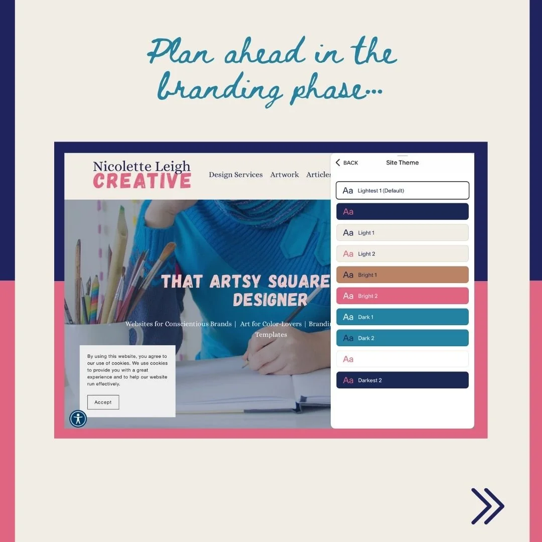
Squarespace autofills up to 10 color applications of your chosen palette.
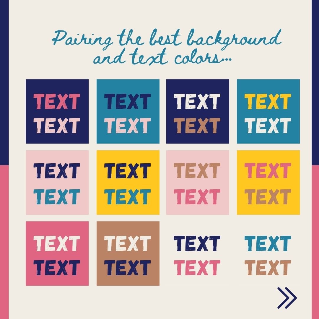
Be sure to pair text with backgrounds that have enough contrast so your viewers don’t need to squint to get a better view.
3. Additional font(s) if you only chose one or two for your logo
I like to pair a bold font for headlines with a script for subheadings and a sans serif or serif font depending on your vibe for the body font. You can see this in my own branding. But of course this is not a requirement. I personally think the variation helps with hierarchy and adds a modern touch rather than using one rather uninteresting font for all of your information.
Heading
Subheading
Body
4. Consistent photography or graphics choices
Odds are, if you didn’t initially invest in a full brand package, then you may not have any guidance on the aspects of your imagery that will help keep your brand consistent.
For instance, will you apply a filter to photographs to give them a futuristic or retro vibe? Which filter is that? Will you apply a certain style of border to all text boxes and images- and why or why not? Will you combine a certain type of illustrated icons with a certain kind of photographic style? Will one specific element always be animated and uploaded as a GIF?|
Round out Your Brand Before you Start Designing
When you know all of your own brand “rules” ahead of designing your website, the process will be much smoother.
Be sure to create a simple style guide in Docs or Canva to take note of all of your brand rules so you can quickly remind yourself. Over time they will become second nature.
When you write all of these things down you have the added benefit of being able to hand it off to a designer or VA who can help you complete these design tasks in the future, consistently.
If you need a hand understanding all of the various aspects of branding and organizing your information and files for design projects, download my Prep for Web Launch Guide to learn more. You will find a Trello board linked there as well to help organize all of your assets plus a link to a spreadsheet you can copy if you need help adding products to your Squarespace store.


Links on this page may be affiliate links meaning I will get a commission IF you purchase something. In many cases you will also get a perk of some kind. Win/win! I only advertise affiliate links for products I use and reccomend whole-heartedly.